How to Make AI Icons for Apps
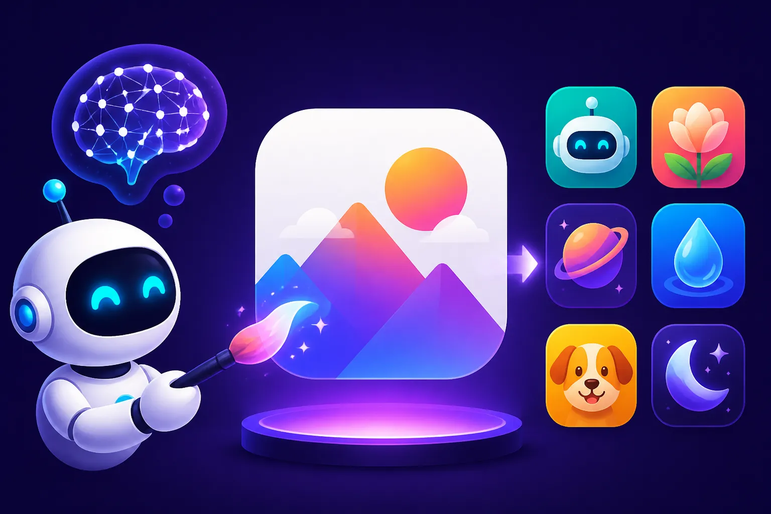
Finding truly unique, eye-catching app icons that perfectly encapsulate your brand can feel like an impossible task, especially if you're not a graphic design wizard or your budget is stretched thin. The frustration of endless stock image searches or trying to communicate a vision to a designer only to get something "close but not quite" is real. This comprehensive guide will walk you through the exciting world of AI image generation specifically for app icons, helping you leverage powerful tools to create distinctive, high-quality visuals for your applications.
Getting Started: The Magic of AI for App Icon Creation
Let's face it, the traditional design process for something as small yet crucial as an app icon can be lengthy and expensive. You might sketch ideas, hire a designer, go through multiple rounds of revisions, and still not land on that perfect visual. This is where AI swoops in as a game-changer, offering an unparalleled ability to rapidly prototype, iterate, and generate a plethora of creative options.
Why AI is a Game-Changer for App Icons
The beauty of AI in icon design lies in its speed and its capacity for boundless creativity. Instead of days or weeks, you can generate dozens, even hundreds, of unique icon concepts in mere minutes. This isn't just about efficiency; it's about unlocking creative avenues you might never have explored otherwise. Imagine needing an icon that blends a specific animal with a tech aesthetic – an AI tool can dream up combinations you wouldn't typically find in pre-made asset libraries. It removes the barrier of needing advanced design software or a hefty budget, democratizing the creation process for indie developers, small businesses, and even established brands looking for fresh ideas. This accessibility is why so many are exploring options like Best AI Image Generator for Ease of Use to kickstart their visual projects.
Conceptualizing Your App Icon: Beyond the Obvious
Before you even touch an AI generator, take a moment to truly think about what your app is. What's its core function? What emotion does it evoke? Who is your target audience? An icon for a meditation app will look vastly different from an icon for a productivity tracker or a gaming app. Don't just think literally; think metaphorically. If your app helps users organize tasks, "a stylized abstract representation of order" might be more effective than just a tiny checklist. Consider the feeling you want to convey: playful, serious, elegant, futuristic, organic? Jot down keywords that describe your app, its purpose, and its desired aesthetic. These keywords will form the foundation of your AI prompts.
For example, if you're building a fitness app, instead of just "dumbbell icon," you might think: "dynamic, energetic, strong, community, progress." These richer descriptors will lead to far more interesting AI results. Thinking about the overall brand identity is crucial before diving into the actual generation process.
Mastering the Prompt: Guiding AI to Your Ideal App Icon
The secret sauce to stellar AI-generated app icons lies almost entirely in your prompts. AI doesn't read minds (yet!), so you need to be its articulate guide. This isn't just about telling it what you want, but how you want it to look, feel, and function as an icon. It takes a bit of practice, but once you get the hang of How to Write AI Image Prompts, you'll be amazed at the results.
Deconstructing the Effective Icon Prompt
A strong prompt for an app icon typically includes several key elements. Think of it like giving instructions to a detailed artist.
- Subject/Concept: What is the main object or idea? (e.g., "a stylized owl," "a minimalist mountain range," "a glowing orb")
- Style/Aesthetic: How should it look? (e.g., "flat design," "neumorphism," "material design," "vector art," "futuristic," "hand-drawn," "pixel art")
- Color Palette: What colors should dominate or be used? (e.g., "vibrant blues and greens," "monochromatic grayscale," "pastel gradients")
- Context/Purpose: Emphasize that it's an app icon. (e.g., "app icon design," "logo design," "mobile application icon")
- Specific Details/Modifiers: Any particular features or artistic nuances? (e.g., "with subtle shadows," "geometric patterns," "golden ratio composition," "3D render," "with an 'S' inside")
- Negative Prompts (Optional but Recommended): What you don't want. This helps refine the output by telling the AI to avoid certain elements. (e.g., "no text," "not cartoonish," "no busy background," "no realistic photography")
Let's say you're making an icon for a meditation app. A basic prompt might be: lotus flower app icon. This will give you basic results. A much better prompt would be: Minimalist lotus flower app icon, elegant lines, soothing pastel colors, abstract, calming, gradient background, vector art style, clean, simple, harmonious. --no photo, text, busy, complex
Iterative Prompting: The Path to Perfection
You rarely get the perfect icon on the first try. AI image generation is an iterative process. Start with a broader prompt, analyze the results, and then refine your prompt based on what you liked and didn't like. Did you get something good, but the colors were off? Adjust the color part of your prompt. Was it too realistic when you wanted abstract? Add abstract and vector art to your prompt and no photography to your negative prompts. This cycle of generation, analysis, and refinement is crucial for success. Learning How to Get Better AI Image Results is all about this back-and-forth conversation with the AI.
Don't be afraid to experiment with different keywords or even reverse-engineer a prompt from an icon you admire (without copying, of course!). Many tools allow you to use a base image for inspiration, which can be a fantastic way to guide the AI towards a specific aesthetic you have in mind. Exploring resources like AI Image Prompt Guide for Beginners can give you a solid foundation.
From Generation to Integration: Refining and Using Your AI Icons
Generating a cool icon is only half the battle. You need to pick the best one, refine it, ensure it meets technical specifications, and then seamlessly integrate it into your app. This stage bridges the gap between raw AI output and a polished product.
Choosing the Right AI Tool for Icon Design
The landscape of AI image generators is vast and ever-evolving. Each tool has its strengths and quirks. For app icons, you'll want something that can handle diverse styles, from clean vector art to more illustrative or 3D renders, and ideally, something that can produce high-resolution images.
Here's a quick overview of some popular options and what they might offer for icon creation:
| AI Tool | Strengths for Icons | Best For | Price Tier | Key Feature for Icons |
|---|---|---|---|---|
| Midjourney | Highly artistic, great for unique styles, photorealism, and intricate details. | Creative, illustrative, or photorealistic icons. | Paid (various tiers) | Exceptional artistic quality and stylistic control. |
| DALL-E | Good for conceptual, consistent styles, often integrated into other platforms. | Abstract concepts, solid shapes, good for logos/icons. | Paid (credit based) | Strong understanding of complex concepts, API integration. |
| Ideogram | Excellent for typography and text within images. | Icons with integrated letters, numbers, or short words. | Free & Paid | Unrivaled text rendering for icons with initials. |
| Adobe Firefly | Strong for vector-like styles, commercial safety. | Professional, scalable vector-like icons. | Free & Paid | Focus on commercial viability and vector integration. |
| Leonardo AI | Strong control, custom models, good for game art. | Stylized game icons, characters, specific themes. | Free & Paid | Extensive model library for diverse aesthetics. |
| Bing Image Creator | Powered by DALL-E, free, easy to use. | Quick ideas, basic concepts, free exploration. | Free | Accessibility and cost-free generation. |
For app icons, especially those requiring precise text or vector-like crispness, tools like Ideogram or Adobe Firefly might be particularly useful. If you're going for something highly artistic or abstract, Midjourney often shines. Don't hesitate to check out options like Best Free AI Image Generators if you're just starting out, or explore a Leonardo AI Review to see if its features align with your project.
Post-Processing and Exporting Your Chosen Icon
Once you've generated a few promising candidates, you'll likely need to do some post-processing. Very rarely will an AI spit out a perfect, ready-to-use icon in the exact format and resolution you need.
- Upscaling: AI tools often generate images at a moderate resolution. For crisp app icons that look good on all devices, you'll need to upscale them. Many AI tools have built-in upscalers, or you can use dedicated external tools. For example, some tools like Magnific AI excel at this. Dive into guides like How to Upscale AI Images to learn the best techniques.
- Minor Edits and Cleanup: AI isn't perfect. You might find tiny artifacts, slightly jagged edges, or colors that are almost, but not quite, right. A quick touch-up in a traditional image editor like Photoshop, GIMP, or even Canva can fix these. This is also where you might remove any unwanted text that the AI snuck in, especially if you didn't use strong negative prompts. If you encounter issues like strange textures or misaligned elements, articles on How to Fix Bad AI Image Results can offer guidance.
- Vectorization (Optional but Recommended): For ultimate scalability and crispness, converting your raster image (PNG, JPG) into a vector format (SVG, AI) is ideal. This ensures your icon looks perfect on any screen size without pixelation. Many online tools and graphic design software can do this automatically or semi-automatically. Adobe Illustrator or Inkscape are excellent for this.
- Exporting for Platforms: App stores (Apple App Store, Google Play Store) have specific requirements for icon sizes and formats. You'll need to export your icon in various resolutions (e.g., 1024×1024 for iOS, 512×512 for Android) and formats (PNG, with transparent backgrounds where appropriate). Ensure consistency across all exported versions.
Key Considerations for App Icon Success with AI
An app icon isn't just a pretty picture; it's a critical branding element and a functional interface component. Using AI for creation requires you to keep these broader design principles in mind to ensure your AI-generated masterpiece truly performs its job.
Design Principles for Standout App Icons
Even with AI doing the heavy lifting, understanding fundamental icon design principles will elevate your results.
- Simplicity and Clarity: An icon is tiny. It needs to be instantly recognizable and communicate its purpose without clutter. Avoid overly complex designs that get lost when scaled down.
- Memorability: Does your icon stand out from the sea of others? Is it unique enough to be remembered?
- Scalability: Will it look good on a tiny smartwatch screen and a large tablet display? Vectorization helps immensely here.
- Uniqueness: While AI can generate many ideas, always check that your chosen icon doesn't too closely resemble an existing popular app. Aim for originality.
- Relevance: Does it accurately represent your app's core function or brand identity?
- Color Theory: Use colors strategically. Bright, contrasting colors grab attention, while muted tones can convey sophistication or calmness. Ensure good contrast to make the icon easily visible against various backgrounds.
By keeping these principles in mind, you can guide your AI prompts more effectively and better evaluate the generated results, ensuring you select an icon that is not only visually appealing but also strategically sound. Learning How to Prompt for Logos can provide transferable skills for icon design.
Ensuring Brand Consistency and Legal Use
Your app icon is a crucial part of your overall brand identity. It needs to align with your app's color scheme, typography, and overall aesthetic. If your app has a sleek, modern interface, a rustic, hand-drawn icon might feel jarring. Ensure that the AI-generated icon fits seamlessly into your brand guidelines.
When it comes to legal use, always review the terms of service for the AI image generator you are using. Most commercial AI tools allow for commercial use of images generated with paid plans, but some free tiers might have restrictions. It's vital to understand these to avoid any intellectual property issues down the line. While AI images are generally considered novel creations, ensuring that your specific generation doesn't inadvertently infringe on existing trademarks or copyrighted designs is good practice. Always strive for unique designs and consult the provider's licensing terms, especially for commercial applications. This due diligence is part of Best AI Image Generator for Commercial Use considerations.
Disclaimer
The information provided in this guide is for general informational purposes only and does not constitute professional design, legal, or financial advice. Always consult with relevant professionals for specific guidance tailored to your situation. The capabilities and terms of AI tools are subject to change, so always verify current features and licensing agreements directly with the service providers.