How to Prompt for a Specific Color Palette
Have you ever meticulously crafted a fantastic AI image prompt, hitting all the right notes for composition, subject, and style, only to have the generated image come back with a color palette that feels… off? It's incredibly frustrating when your vision of a vibrant, energetic scene appears muted and dull, or your serene, earthy landscape ends up looking like a neon nightmare. Getting your AI image generator to understand and replicate a specific color palette can feel like pulling teeth, but don't worry—this guide is here to walk you through the nuances of prompting for the exact colors you envision.
Decoding How AI Understands Color
Before we dive into specific techniques, it's crucial to understand that AI models don't "see" color in the same intuitive way humans do. They process language and learn patterns from vast datasets of images and their associated text descriptions. This means they're primarily looking for keywords and contextual clues rather than interpreting a visual spectrum with human eyes.
The Nuance of Color Names and Descriptions
Simply saying "blue" might get you any shade from a pale sky blue to a deep navy. The AI picks what it thinks is the most common or contextually appropriate "blue." This often leads to generic results that lack the specific mood or aesthetic you're aiming for. To counter this, your descriptions need to be far more granular and evocative.
Think about the difference between "blue" and "cobalt blue," or "teal," or "cerulean." Each conjures a distinct shade and often, a different feeling. When you say "a forest bathed in deep emerald and mossy greens," you're not just giving color, but also texture, light, and atmosphere. The AI then uses this rich descriptive data to render a more specific visual. This is why learning How to Write AI Image Prompts effectively goes beyond just listing objects; it involves painting a picture with words.
Color Theory as Your Prompting Ally
You don't need a fine arts degree, but a basic grasp of color theory can dramatically improve your prompting success. Understanding common color harmonies helps you describe not just individual colors, but how they should relate to each other in the image.
- Monochromatic: Using different shades, tints, and tones of a single color (e.g., "a scene in shades of lavender, from pale lilac to deep violet"). This often creates a harmonious, subtle effect.
- Analogous: Colors that are next to each other on the color wheel (e.g., "a sunset with warm analogous tones of orange, red, and yellow"). These are naturally harmonious and pleasing.
- Complementary: Colors opposite each other on the color wheel (e.g., "a vibrant composition with complementary colors of rich blue and fiery orange"). These create high contrast and visual excitement.
- Triadic: Three colors evenly spaced on the color wheel (e.g., "a playful scene with triadic colors of bright red, sunny yellow, and cool blue"). These can be bold and vibrant.
By integrating these terms, you're giving the AI a blueprint for a cohesive palette. Instead of just listing three random colors, you're telling it how they should form a deliberate scheme. For creators interested in refining their output, understanding these principles is a key part of getting Better AI Image Results.
Effective Prompting Techniques for Specific Color Palettes
Now that we understand the 'why,' let's get into the 'how.' Getting AI to honor your color requests often comes down to precise language, strategic placement, and sometimes, leveraging advanced features.
Using Descriptive Color Adjectives and Nouns
This is your primary weapon. Instead of broad terms, get specific.
- Specify Intensity and Tone: "Vibrant red," "muted blue," "pastel pink," "deep forest green," "bright fuchsia," "pale ivory," "electric neon yellow."
- Contextualize Colors with Objects: "A room with walls painted a soothing sage green," "a character wearing a striking crimson cloak," "a landscape with golden hour light casting warm sepia tones."
- Reference Styles or Eras: "Vintage color palette," "1980s synthwave neon colors," "Art Deco emerald and gold scheme," "a retro aesthetic with teal, coral, and cream."
Consider this: "A cozy living room with a dominant warm, earthy palette." This prompt suggests browns, oranges, deep yellows, and maybe a touch of olive green, all without explicitly listing every single color. You're giving the AI a theme to follow.
Leveraging Color Palette Terms and References
Many AI models have been trained on terms specifically related to design and art. Use them!
- "A harmonious pastel palette": This implies soft, light colors like baby blue, mint green, blush pink, and pale yellow.
- "A monochromatic grayscale image with strong contrast": Tells the AI to use only black, white, and shades of gray.
- "A vibrant analogous color scheme of purples, blues, and magentas": Guides the AI to use colors next to each other on the color wheel, specifically in the cool-to-warm purple range.
- "A futuristic cityscape bathed in neon cyberpunk colors": This immediately brings to mind electric blues, hot pinks, bright greens, and purples.
You can also name specific well-known palettes or color combinations if you know them, although results might vary. For instance, "a desert scene with a Southwestern palette of terracotta, turquoise, and sandstone" is highly descriptive and likely to yield good results.
The Role of Prominence and Placement
Where you place your color descriptions in the prompt can sometimes influence the AI. Generally, the earlier and more frequently you mention a color or palette, the more weight the AI might give it.
Consider this structure:[Subject] with a dominant color palette of [Color 1], [Color 2], and [Color 3]. [Additional details about scene, style, lighting, etc.]
Or, integrate color throughout:A [Color 1] sunset over a [Color 2] ocean, with [Color 3] reflections on the water. Highly detailed, photorealistic.
Some tools, like Midjourney, allow you to use specific parameters or weights (::) to emphasize certain parts of your prompt. If your AI tool supports this, giving more weight to your color terms can be incredibly effective. Learning How to Use Weights in AI Prompts can dramatically improve your control over image generation.
Hex Codes and RGB Values: A Word of Caution
While some advanced AI tools or plugins claim to accept hex codes (e.g., #FF0000 for red) or RGB values, most general-purpose AI image generators are not designed to directly interpret these. They are much better at understanding natural language. Trying to force a hex code into a prompt often leads to the AI ignoring it entirely or misinterpreting it as just another alphanumeric string.
If your specific tool has a feature for direct color input via a color picker or hex code, use that. Otherwise, stick to descriptive language. The nuance of a "deep sea green" is often more effective than attempting to input #006400 in a standard text prompt.
Practical Examples and Advanced Color Control
Let's put these techniques into practice with some real-world scenarios and explore how to refine your color output.
Scenario 1: Crafting a Vibrant, Energetic Image
Imagine you want an image of a bustling street market in a fantastical city, bursting with life and vivid colors.
Initial, less effective prompt: A street market, fantasy city, many people, food stalls. (Likely to be generic and perhaps muted).
Improved prompt focusing on color: A bustling, vibrant street market in a fantastical city, **dominated by a warm and energetic color palette of saffron yellow, ruby red, and sapphire blue**. Intricate details on merchant stalls, exotic fruits in rich hues, dynamic lighting, high fantasy art style.
Here, we're not just listing colors; we're describing their vibrancy and energy and associating them with specific elements. The term "warm and energetic" itself guides the AI toward brighter, more saturated tones.
Scenario 2: Designing for a Brand Look or Specific Aesthetic
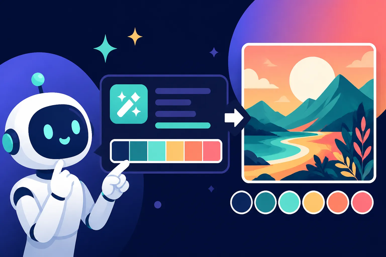
Let's say you're a designer trying to create marketing collateral for a tech startup whose brand colors are a sleek teal, clean white, and a sophisticated charcoal grey.
Prompt: A clean, minimalist workspace with a computer screen displaying sleek analytics. The scene uses a **modern brand palette of cool teal, pristine white, and sophisticated charcoal grey.** Natural light, sharp lines, professional photography.
By explicitly stating "modern brand palette" and listing the colors with descriptive adjectives ("cool teal," "pristine white," "sophisticated charcoal grey"), you're giving the AI clear instructions to adhere to this aesthetic. This is particularly useful when creating images for commercial use, where brand consistency is paramount.
Using Reference Images and Style Transfer
Many advanced AI image generators allow you to upload an image as a reference. This is a game-changer for color! If you have an existing image with your desired color palette, feeding it to the AI as an "image prompt" can help it capture the mood, composition, and color scheme you're after. Some tools even let you adjust the weight or influence of the reference image. This technique is extensively covered in guides like How to Use Reference Images in Prompts.
For example, you could take a photograph of a Tuscan landscape known for its specific golden light and earthy tones, and then prompt the AI to generate a "fantasy village in the style of the reference image," which would help carry over that characteristic color palette.
Iterative Prompting and Refinement
Rarely do you get the perfect image on the first try, especially with specific color requests. Expect to iterate. Generate a few options, identify what's working and what's not, and refine your prompt.
- If colors are too dull: Add words like "vibrant," "saturated," "bright," "luminous," "bold."
- If colors are too strong: Try "muted," "soft," "subtle," "desaturated," "pastel tones."
- If a specific color is missing: Reiterate that color more prominently, or assign it to a distinct object.
Here’s a helpful table comparing descriptive language for color:
| Desired Effect | Less Effective Prompt Term | More Effective Prompt Terms | Example Use |
|---|---|---|---|
| Vibrant Red | Red | Ruby red, crimson, scarlet, fiery red, passionate red | A fiery red dragon soaring over a volcanic landscape. |
| Muted Blue | Blue | Dusty blue, steel blue, slate blue, denim blue, tranquil blue | A serene room with dusty blue walls and natural light. |
| Earthy Tones | Brown, green | Terracotta, olive green, sandstone, mossy, rustic, autumnal palette | A cozy cabin interior bathed in autumnal, earthy tones. |
| Bright & Cheerful | Colorful | Playful palette, rainbow bright, vivid primary colors, cheerful hues | A children's book illustration with a playful, rainbow bright palette. |
| Dark & Moody | Dark colors | Somber palette, gothic, deep chiaroscuro, desaturated, ominous, shadowy | A gothic, somber palette for a mysterious ancient castle at night. |
| Clean & Minimalist | White | Pristine, minimalist, crisp, stark white, cool white, neutral tones | A modern kitchen with a pristine, minimalist color scheme of white and light wood. |
This systematic approach to refining your AI Image Prompt Formulas helps you dial in exactly what you want.
Troubleshooting Common Color Prompting Issues
Even with the best techniques, AI can sometimes be stubborn. Let's tackle some common frustrations you might encounter when trying to control your image's color palette.
AI Ignoring Your Color Requests
This is probably the most common headache. You say "purple," and you get blue. You ask for "gold," and it's yellowish-brown.
- Be More Descriptive and Repetitive: Don't just say "purple flower." Try "a vibrant orchid-purple flower with dew drops." Sometimes, simply repeating the color description in different parts of the prompt helps reinforce it.
- Contextualize the Color: If you want a specific color to be dominant, tie it to a major element. "A vast ocean under a deep sapphire blue sky, with streaks of coral pink clouds."
- Check for Conflicting Terms: Are you asking for "vibrant green forest" but also "misty, ethereal atmosphere"? The latter might push the AI toward softer, desaturated tones that conflict with "vibrant." Remove conflicting terms or use parameters to weigh one over the other.
Colors Bleeding or Mixing Unexpectedly
Sometimes, your specified colors might blend into muddy messes or appear in areas where you didn't intend them.
- Define Areas Clearly: If you want a specific color on a specific object, be very precise. "A red apple on a green table" is better than "a red apple and a green table."
- Use Negative Prompts for Unwanted Colors: If a certain color keeps appearing or bleeding, use negative prompts. For example, if your "blue and orange" image keeps getting hints of purple, add
no purpleor_purpleto your negative prompt. This is a powerful technique detailed in How to Use Negative Prompts. - Consider
--style rawor Equivalent: Some AI models have a "raw" style or parameter that reduces artistic interpretation, making the AI adhere more strictly to your prompt. This can be very useful for precise color control, as the AI is less likely to inject its own creative color choices.
Lack of Vibrancy or Overly Saturated Results
Getting the right level of color intensity is a delicate balance.
- For Lack of Vibrancy: As mentioned, use terms like "vibrant," "rich," "luminous," "saturated," "bold," "bright." Also consider adding lighting descriptors like "sun-drenched," "high contrast lighting," or "studio lighting" which can imply vivid colors. Check out How to Add Lighting to AI Prompts for more ideas.
- For Overly Saturated Results: Employ terms like "muted," "desaturated," "soft colors," "subtle tones," "pastel palette." If a tool has a "saturation" parameter, adjust that down. Sometimes, specifying an artistic style that naturally uses softer colors, such as "watercolor painting" or "vintage photograph," can help.
When All Else Fails: Embrace Iteration and Experimentation
AI image generation is as much an art as it is a science. Sometimes, a slight rephrasing, a different synonym, or even moving words around in your prompt can dramatically change the outcome. Don't be afraid to experiment! Try drastically different approaches if your current one isn't working. Generate many variations and see which direction gets you closer to your desired color palette. This iterative process is crucial for mastering tools and is often discussed in guides like How to Create Image Variations.
Remember, you're guiding an AI, not programming it. Your words are its visual instructions, so make them as clear, descriptive, and evocative as possible. With practice, you'll become a maestro of color palettes in your AI-generated art!
Disclaimer
The information provided in this article is for general guidance only and is based on the current understanding and capabilities of AI image generation tools. Features, functionalities, and effectiveness of specific prompts may vary between different AI models and platforms. Always refer to the specific documentation for the AI tool you are using.